The novel coronavirus (COVID-19) continues to spread globally, and at this point in its progress very few high-income countries have escaped its grip. On a per-capita basis Spain has 38 times the rate of infection of China, the US 10 times and Australia 3 times, but plucky Japan has only 0.3 times the infection rate of China. Until now the rate of growth has been low, with only tens of cases per day being recorded over much of February and March, but since last week the alarm has been sounding, and the government is beginning to worry. We had our first lockdown on the weekend, a voluntary two days of 自粛 in which everyone was supposed to stay inside, and this week discussion of lockdown began. This is because the previous week was a bright, sunny weekend with the cherry blossoms blooming, and all of Tokyo turned out to see them despite the Governor’s request for everyone to be cautious. Over the two weeks leading up to that weekend, and for perhaps two days afterwards, the train system returned to normal and Tokyo was being its normal bustling, busy uncaring self. But then on the week after that event the numbers began to climb, and now the government is worried as it begins to watch the numbers slide out of control. I am also now hearing for the first time stories of doctors having to find alternative ICU beds for COVID patients – still not a huge deal, because any one hospital does not have a large supply, but enough cases are now appearing to force doctors to seek empty hospitals elsewhere.
It is possible to see the effect of this party atmosphere in the data, and it offers a strong example of how important social distancing is. Using the data from the Johns Hopkins Coronavirus tracker (and making a few tiny adjustments for missing data in their downloadable file), I obtained and plotted the number of new cases each day, shown in Figure 1 below. Here the x axis is the number of days since the first infection was identified, and the y-axis is the number of new cases. Day 70 is the 1st April. The red line is a basic lowess smooth, not a fancy model.
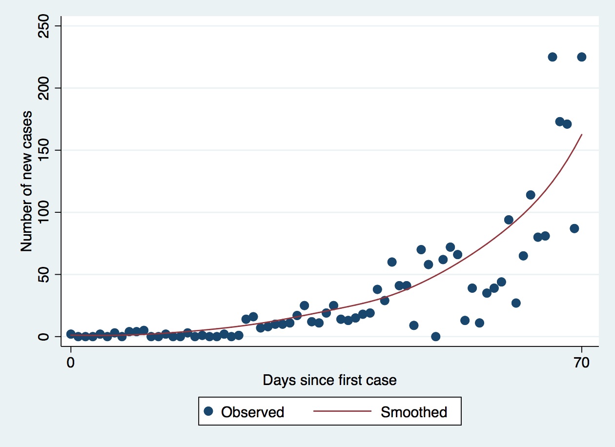
It is clear from this figure that things changed perhaps a week ago. New case numbers were up and down a lot but generally clustered together, representing slow growth, but since about a week ago the gaps between each dot are growing, and more dots are above than below the line. This is cause for concern.
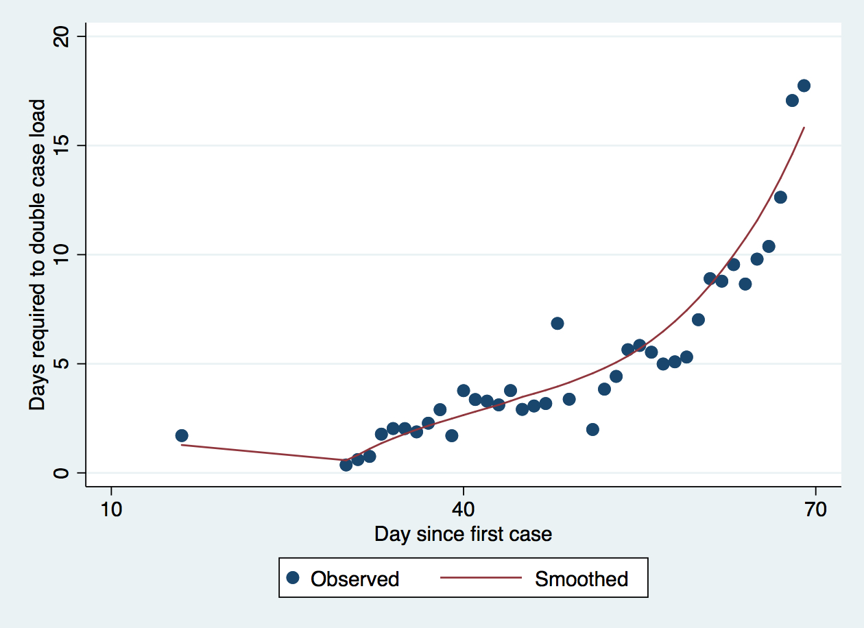
However, it is worth remembering that each day the total number of cases is increasing, which means also that if you add the same number of new cases on any day, it will have a proportionately smaller effect on the total. We can estimate this by calculating the percentage change each day due to the new cases added on that day. So for example if there are 10 cases in total and 10 new cases are detected we see a 100% change; but 10 new cases with 100 existing cases will lead to only a 10% change. From this we can calculate the daily doubling time: the time required for the number of cases to double if we keep adding cases at the same percentage increase that we saw today. So, for example, if there are 100 cases on day 9 and on day 10 there are 10 more cases, the percentage change is 10%, and from that I can estimate that the number of cases will double after 7.2 days if that 10% daily change continues. This gives a natural estimate of the rate at which the disease is growing, adjusting for its current size. Figure 2 shows the doubling time each day for Tokyo, again with the number of days since the first infection on the x-axis. I have trimmed the doubling time at 20 days, so a few early points are missing because they had unrealistically high doubling times, and added a lowess smooth to make the overall pattern stand out. The vertical red line corresponds with Friday March 20th, a national holiday and the first day of the long weekend where everyone went cherry blossom viewing.
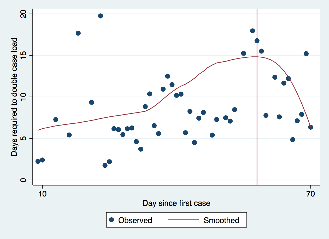
Since the infection hit Japan the doubling time has been growing slowly, so that in February it would take almost two weeks for the number of cases to double. The doubling time dropped in March[1], which was also the time that the government began putting in its first social distancing guidelines (probably about late February); work events were being canceled or postponed by early March, probably in response to government concern about the growing number of cases, and this appears after two weeks to have worked, bringing the doubling times back up to more than two weeks. And that was when the sunny weather came and everyone went to hanami, marked on the red line, at which point the doubling time dropped like a stone. Back in the middle of March we were seeing between 10 and 40 cases a day, slow changes; but then after that weekend the number of cases exploded, to 100 or 200 a day, pretty much 4-6 days after the long weekend started. The following weekend was when the government demanded everyone stay in, and the city shut up shop; but we won’t begin to see the effect of those measures until tomorrow or this weekend, and right now the number of new cases is still hovering around 200 a day.
It’s worth noting that not all of these cases are community transmission. About 10% are without symptoms, and another 20% are having symptoms confirmed (probably because they’re very mild), which indicates the effectiveness of contact tracing in tracking down asymptomatic contacts. A lot of these cases are foreigners (something like 20-25%), and this is likely because they’re residents returning from overseas, and likely identified during quarantine/self-isolation (so not especially risky to the community). But still, even 70% of 200 is a lot of cases.
It’s instructive to compare this doubling time with some heavily-affected countries. Figure 3 shows the smoothed doubling times for Japan, the US, Italy and Australia. It has the same axes, but I have dropped the data points for clarity (I make no promises about the quality of these hideous smooths). The legend shows which country has which colour. Italy and Australia start slightly later in this data because their first imported case was not at day 0.
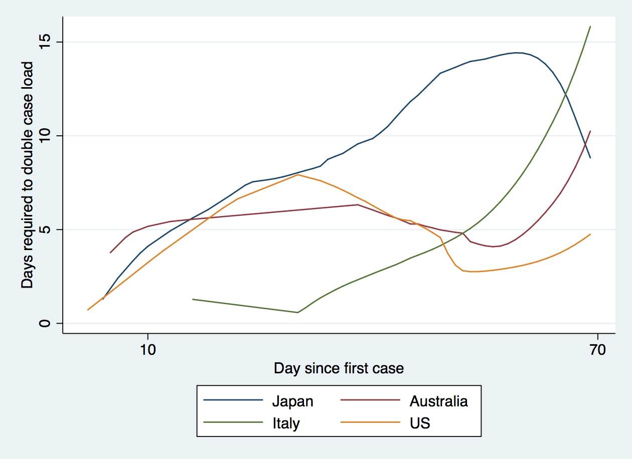
As you can see, Italy’s doubling time was almost daily in the first week of its epidemic, but has been climbing rapidly since they introduce social distancing. Australia’s doubling time was consistently a week, but began to increase in the last two weeks as people locked in. The US tracked Japan for a couple of weeks and then took a nose dive, so that at one point the daily doubling time was 3 days. Italy provides a really instructive example of the power of social distancing, which was introduced in some areas on February 28th and nationally in increasingly serious steps from 1st March to 9th March. Figure 4 shows Italy’s doubling time over the epidemic.
It is very clear that as measures stepped up the doubling time gradually increased. In this figure day 40 is the first of March, the first day that national measures were announced. Despite this, we can see from Figure 3 that it took Italy about a month and a half from the first case to slow the spread enough that further doubling might take a week, and early inaction meant that a month of intensely aggressive measures were needed to slow the epidemic, at huge cost.
It is my hope that Japan’s early measures, and aggressive investigation of clusters at the beginning of the outbreak, will mean that we don’t need to go into a month-long lockdown. But if Japan’s population – and especially Tokyo’s – don’t take it seriously now, this week and this weekend, Tokyo will go the same way as London and Italy. It’s time for Tokyo to make a two week sacrifice for its own good. Let’s hope we can do it!
fn1: Which the smooth doesn’t show, by the way, it’s an awful smooth and I couldn’t improve it by fiddling with the bandwidth[2]
fn2: A better model would be a slowly increasing straight line with a peak at the hanami event and then a rapid drop, but I couldn’t get that to work and gave up[3].
fn3: Shoddy jobs done fast is my motto!

Leave a comment